
Asheville, N.C. | June 20, 2026 — The American Homebrewers Association® (AHA), the national nonprofit organization dedicated to advancing the hobby of homebrewing, announced the winners of the 2026 National Homebrew Competition (NHC) during the awards ceremony at Homebrew Con in Asheville, N.C.
A total of 120 medals were awarded across 40 categories, recognizing outstanding homebrewed beer, mead, and cider. The competition also honored eight individuals, clubs, shops, or organizations for contributions to the homebrewing community.
Since the first AHA National Homebrew Competition in 1979 in Boulder, Colo., more than 170,000 entries have been evaluated, making the NHC the world’s largest and longest-running homebrew competition.
The 2026 competition received 3,575 entries from 1,054 AHA members across 46 states, Washington, D.C., and 7 countries.
First Round entries were judged in nine cities: San Diego, Calif.; Chicago, Ill.; Indianapolis, Ind.; Kansas City, Mo.; Longmont, Colo.; Philadelphia, Pa.; San Francisco, Calif.; Seattle, Wash.; and Tampa, Fla. The Final Round was judged June 17–18 in Asheville, N.C.
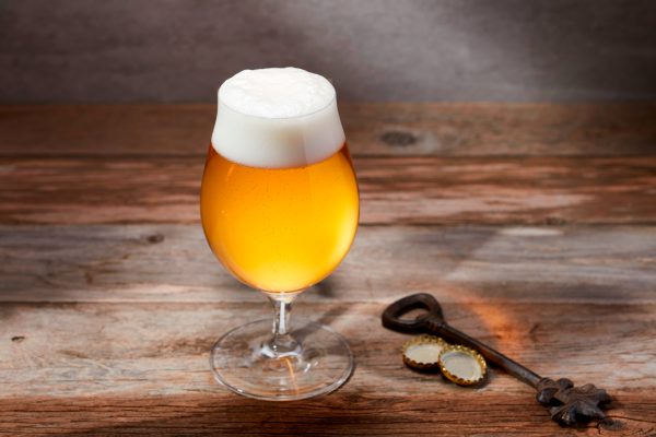
Most-Entered Style Categories
The winners of the top three most entered categories are:
Dark European Lager (Table 7): 152 entries
- GOLD: David Towles | Amarillo, TX | High Plains Drafters [TX]
- SILVER: Beth Migalla | Highland Park, IL | North Urban Brewing Society (NUBS)
- BRONZE: Chris Kaebisch | Edgerton, WI
Pale European Beer (Table 2): 137 entries
- GOLD: Steven Severn | Santa Ana, CA | Orange County Mashups
- SILVER: Ron Barnes | Basehor, KS | Kansas City Bier Meisters
- BRONZE: Juan Pablo Salcedo | San Ysidro, CA | Tijuana Homebrew Club
Strong Belgian Ale (Table 26): 123 entries
- GOLD: Nicholas B Griner | Ayer, MA | Merrimack Valley Homebrew Club
- SILVER: Kevin Kiernan | Washington, DC | DC Homebrewers
- BRONZE: Guillermo Velasco | Tijuana, BC | Tijuana Homebrew Club
A complete list of winners of the 2026 National Homebrew Competition can be found here.
Major Awards
In addition to category style awards, six major awards recognizing overall brewing excellence were presented.
Homebrewer of the Year Award – Sponsored by Grainfather
- Recognizes the best-of-show beer judged from all gold medal winners in beer categories.
- Benjamin Frymark | San Diego, CA
Cidermaker of the Year Award
- Recognizes the best-of-show cider judged from all gold medal winners in cider categories.
- Jeffrey Carlson | Grand Rapids, MI
Meadmaker of the Year Award – Sponsored by Redstone Meadery
- Recognizes the best-of-show mead judged from all gold medal winners in mead categories.
- Kyle Ducharme | Saint Albans, VT
Ninkasi Award – Sponsored by Samuel Adams
- Recognizes the entrant who accumulates the most points in the Final Round of competition.
- Dan Acheson | Winfield, IL
Gambrinus Club Award – Sponsored by Trip’s Beer Trips
- Recognizes the club garnering the most Final Round points per total club entries.
- Portland Brewers Collective | Portland, OR
Homebrew Club of the Year Award – Sponsored by Under the Jenfluence
- Awarded to the club accumulating the most total points in all categories of beer, mead, and cider in the Final Round of competition.
- Kansas City Bier Meisters | Kansas City, MO
“Every year, I continue to be impressed by the rising quality of entries in the National Homebrew Competition,” said Charlie Harr, Chair of National Homebrew Competition. “The creativity, technical skill, and care that homebrewers, meadmakers, and cidermakers bring to this competition is remarkable. Earning a medal at the NHC is an incredible achievement, but every entrant should be proud to have brewed and shared their work on this stage. This competition is the most prestigious in homebrewing, and it is made stronger by the community behind it: the entrants who push the hobby forward, the judges who lend their expertise, and the volunteers who make the competition happen. That shared passion is what makes the AHA and NHC so special.”
View previous winners here.
Annual Recognition Awards
The AHA also recognized people and organizations that inspire, support, and grow the homebrewing community.
Homebrew Shop of the Year Award
- Nominated by AHA members and selected by the AHA Community and Education Committee, this is awarded to the world’s top homebrew supply shop on the merits of community support, education, customer service and engagement, promotion of homebrewing, and responsible business practices.
- BrewHardware | White House Station, New Jersey
American Homebrewers Association Advocacy Award
- This is the homebrewing world’s top achievement, identifying the individual who has made the most meaningful, lasting impact in support of the American Homebrewers Association and the broader homebrewing community. This award recognizes those whose efforts will benefit homebrewers and the AHA for generations to come.
- Sandy Cockerham | Indianapolis, Indiana
- Read more about Sandy’s contributions to homebrewing here.
Thank You, NHC
The 2026 National Homebrew Competition was made possible in part by the generous support of sponsors, First Round judging sites and organizers, Final Round volunteers, and the homebrewing community. Special thanks to the Beer Judge Certification Program, The Renaissance Hotel for hosting the awards ceremony, and Hi-Wire Brewing for receiving Final Round entries. You all helped bring the 2026 competition to life.
Photos for media use are available upon request. Contact info@homebrewersassociation.org for requests and inquiries.
About the American Homebrewers Association®
Founded in 1978, the AHA is built and directed by members, grounded in the values of community, education, joy, and volunteerism. We deliver unmatched resources (Zymurgy® magazine), recipes (National Homebrew Competition-validated), resources (HomebrewersAssociation.org), and rewards (AHA Member Deals, Annual Recognition Awards, and National Homebrew Competition Awards).
The AHA operates as both a 501(c)(6) membership organization and a 501(c)(3) supporting organization (the A-Ha Foundation). Join us.
About the National Homebrew Competition
The National Homebrew Competition (NHC) gives homebrewers a chance to receive invaluable feedback on their entries and also recognizes the most outstanding, world-class homebrewed beer, mead, and cider. In 1979, 34 entries competed in the first American Homebrewers Association (AHA) National Homebrew Competition held in Boulder, Colorado. Since 1979, more than 170,000 entries have been evaluated, and the NHC has become the largest homebrew competition in the world.


Share Post